Your Cart is Empty
Sale! Save up to 40% off on all orders. No coupon code necessary. Ends friday 3/6 Midnight EST.
Sale! Save up to 40% off on all orders. No coupon code necessary. Ends friday 3/6 Midnight EST.
Sale! Save up to 40% off on all orders. No coupon code necessary. Ends friday 3/6 Midnight EST.
Sale! Save up to 40% off on all orders. No coupon code necessary. Ends friday 3/6 Midnight EST.
March 04, 2020 9 min read
TABLE OF CONTENTS:
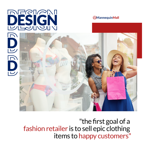
Effective display design is the cornerstone of an effective visual merchandising strategy for any fashion retailer. Look, if the first goal of retail fashion business is to sell epic clothing items to happy customers, it stands to reason that how customers are introduced to a product or collection of products is a vital part of the overall strategy.
In this guide, we are going to explore the principles of visual merchandising and how they relate to the ever-evolving fashion industry. But great merchandising is more than just theory, so we dig deep into the art and science of display design (a passion of ours), and give you several good examples of quality displays you can replicate for your own store.
So why should you even care about visual merchandising? Maybe you got into fashion to escape clunky corporate vernacular, but no matter how you arrived at this point in your career, if you're responsible for driving sales in retail, then you are already engaging in visual merchandising.
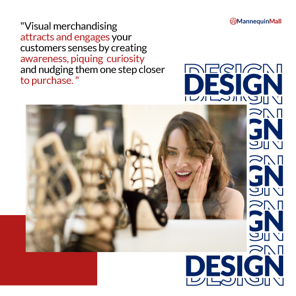
Visual merchandising is the art and science of designing an environment to influence customer behavior and increase sales. Good merchandising attracts and engages your customers' senses by creating awareness, piquing curiosity and nudging them one step closer to purchase.
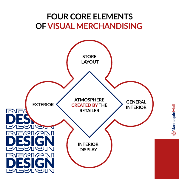
There are four core elements of visual merchandising:
Window display design sits neatly in both Interior Displays and Store Exterior, so we will mainly focus our exploration there. But if you are just learning about visual merchandising, it's worth your time to research the other elements as well.
It's not hard to feel challenged by visual merchandising when you consider the totality of the customer experience in your store. And window displays are probably the most iconic, if not the best-leveraged form of display marketing in your store.
Retail studies have shown that even after over 100 years of advancement, window displays are still your silent salesperson. It's a visual pitch deck, and those same studies have shown that 40% of people will choose which store to shop at based on eye-catching Window displays.
And while in-store displays have been rising in popularity, store windows often seem like an afterthought to most retailers. They sit there, staring into the street, half-covered by vinyl posters. A cluttered, lifeless window into a dying retail experience.
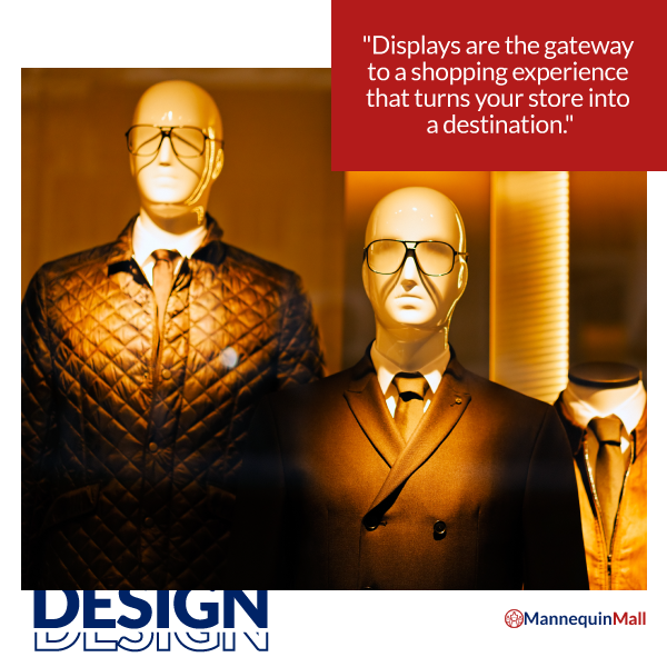
But it doesn't have to be. There is more than enough research to suggest that displays are the gateway to a shopping experience that turns your store into a destination. Great displays make us excited, curious and feel welcome in the store. They give us permission to imagine ourselves in a brand narrative we want to be apart of.
This is why the sports mannequin you see surfing down a wave of blue gossamer, fending off a shark made of old electronics is so compelling. Wewantto be the surfer. We want to escape from increasingly predatory technology. And even if we know it's not how "the real world works," we'll go inside anyway. Why? Because at least the store that created the visual display "gets it." That connection is one of the last reasons why customers will buy from your neighborhood store instead of Amazon.

We mentioned it before, but it bears repeating, window displays are one of the most vital marketing activities you can use to pull shoppers out of their cell phones, entice them to come into your store or transition into an exciting area inside your store.
Over the last century, many trends, theories and techniques, and materials have come, gone and evolved again, but the primary goals of window display design have remained the same.
You don't have to win the Christmas display show in New York to be a great designer. Great window design begins with an understanding of the core design principles and techniques that give structure and impact on your creative efforts. Before we move into the individual tips, let's start with these core techniques.
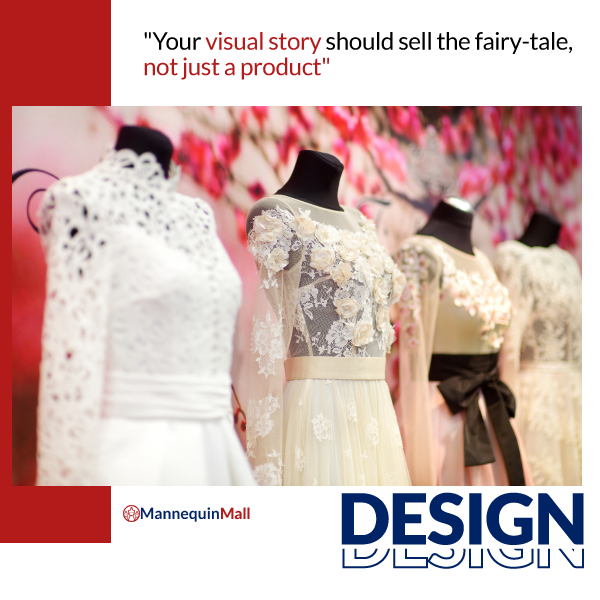
You will hear it repeatedly, but smart visual merchandising is a form of silent storytelling. You are communicating your brand message and intent to your customers with everything from your architecture to your layout to your employees' uniform.
In window display design, this principle is even more explicit. What draws us to displays is the story it tells us. A great display can walk us through a story from beginning through climax and resolution. When developing a visual story in your display ask yourself the following:
If you have ever wondered how some visual merchandisers manage to create such eye-popping display windows? How do they create that emotive feeling, bring a setting to life, and attract shoppers like bears to honey? The secret is color and light.
Color used in visual merchandising is one of those long term activities where people spend years refining their skills. But you don't need 10 years of experience or a master's degree to use color smartly. As a visual merchandiser, you want to develop your color palette early with your story in mind. And while matching colors looks tough, it's actually a fairly objective process. Once you choose your primary color, you can use a service like this to create a harmonious color palette that strikes the tone you're looking for.
At that same time, remember that color choices are not random. Before you choose your colors, make sure you account for important factors like brand association and color psychology. Before you incorporate colors into your product displays, brands you are highlighting and what other companies tend to use those colors.
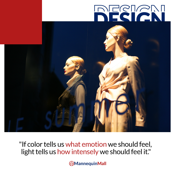
Once you have your color palette and your display planned out, it's time to think about lighting. If color tells us what emotion we should feel, light tells us how intensely we should feel it.
It's not good enough to simply light your window display. Take the time to adjust the position, angle, temperature and even color of your lights. Where the light goes, the eye follows, so use your light to put focus on important products or raise the dramatic tension in your scene.
When you create a window display, it's natural to have a variety of object sizes, weight, shapes, colors, shadows, etc. For good retail design, it's important to balance these elements to create a pleasing and welcoming aesthetic.
One of the most basic and most loved visual design principles is the pyramid. The pyramid principle is a type of visual hierarchy. The object that gets the most attention lives on top, but the design guides the viewer's eyes down to other objects.
The same logic holds for sales priority (the object you want to sell the most is the focal point), color (more colorful items at the top and monochromatic at the bottom) or size (smaller on top). Done intentionally, you can create balanced displays that evoke feelings of anticipation, excitement, and intrigue, or even intentionally unbalanced displays to signal tension, drama or anxiety. Just remember to trust your gut here, your mind already knows what balance looks like. If it feels off, it probably is.
While we become unnerved by unbalanced objects (bad), our minds react in a nearly opposite manner to symmetry. Perfect symmetry is like a stop sign for the brain. It blurs all the visual elements into a single focus and message. Great for traffic, but when you are trying to tell a story, it's mind-numbing.
Luckily for you, there is a simple fix for symmetrical boredom. Odd numbers. You see, an odd number of objects in your display causes just enough unbalance that the eye keeps moving around the display to take in all of the individual elements. It's the visual equivalent of keeping someone "on their toes."
Now that you know the principles that will make your display work and what elements are required to tell your story, it's time to dive into your own creative process and create a display that captures customer's attention and captures your brand message. But before you get started, check out these tips to make sure your final window display is as successful as your vision.
Done right, your window display ideas have the potential to grab attention, bring in new customers, sell your favorite products, build your brand and even help you go viral on social media or your local news.
Catching the interest of buyers with a creative theme and a bold presentation is an effort that is both gratifying and profitable.
What are your favorite window displays? Do you have a mannequin display or visual merchandising example that you're especially proud of? Leave your pictures stories in the comments, let's all elevate our collective style.
And last but not least, if you have any questions our Customer Support Team is ready to help. Whether you are looking for ghost or invisible mannequins for fashion photography, mannequin torsos, or professional dress forms, we are here and ready to help.
Email us today at support@mannequinmall.com or give us a call at 1-800-365-3297.
Comments will be approved before showing up.