Your Cart is Empty
Sale! Save up to 40% off on all orders. No coupon code necessary. Ends friday 3/6 Midnight EST.
Sale! Save up to 40% off on all orders. No coupon code necessary. Ends friday 3/6 Midnight EST.


Next up we have 35 more incredible display windows from all kinds of stores all over the world.
#65. This window makes us crave some cotton candy, just look at how delicious this is. Bergdorf Goodman does it again. Those mannequins are perfect in those pop pink dresses and notice how amazing that cotton candy puddle looks.
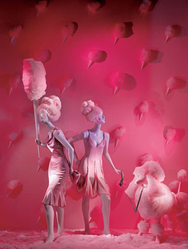
#64. Bottega Veneta, in 2014 had this amazing idea for a Christmas display, namely to put a lot of mailboxes filled with their gorgeous bags and wallets. Every woman’s dream.
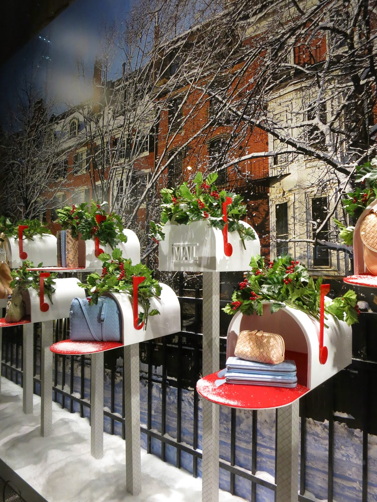
#63. Speaking of bags, this next window was created for Fendi in 2013 in a very 60’s style due to those bright colors and contrasts of non-colors and to those patterns, Groovy!

#62. Marc Jacobs, in 2013 created this beautiful installation by using bright colored cog wheels to showcase their product.

#61. In the same year, Moschino designed this amazing window, by turning mannequins into delicious and colorful ice cream with a cherry on top, perfectly assorted with their products.

#60. Hermès is up again and presented this incredible display to the public in 2013. Surrealism is clearly the theme here, looking like something inspired from a Dali panting. This view simply jolts our imagination into working wonders.

#59. Lanvin sure knows how to make their windows pop and this one In particular caught our eyes. It’s incredible how a few simple items when combined and turned into an installation have the power to transmit emotion and motion. We love how these people showcase their product!

#58. Here we have another superb display this time from Moncler, in 2012. This awe inspiring display makes us think of luxurious yacht trips dressed in those exact outfits.

#57. This Isabel Marant window designed by Arnold Goron back in 2011, is absolutely amazing. This gives us the idea of molecular structures but besides the astounding design, these sculptures if you may are in fact kinetic, meaning that they move.

#56. Absolutely amazing how the people at Hermès put their shoes in focus with this display. They created a beautiful contrast and the idea that the mannequin is diving.

#55. We move on to another Louis Vuitton window display that will blow your mind. There is an entire series of displays created for the famous bag brand built around the idea of ostriches. We liked this one best but there are others that involve eggs, and extended necks.

#54. Zara has started making their own powerful displays, this one here is related to climbing the ladder towards success.

#53. Majestic is the best word to describe this display from Alexander McQueen. Just look at that fantastic dress, and that gigantic red bird. It’s breathtaking!

#52. The Kate Spade store in NY had an amazing idea for their display, namely to paint the building a bright yellow, making their products simply pop out. But that’s not all, they installed a vending machine right outside so that customers could shop non-stop.

#51. There is another display made for Isabel Marant created by Emilie Faif that is absolutely dazzling. It’s very simple and yet suggestive, bringing the romance from old movies onto the streets through lovely dresses.

#50. This impressive piece of work was created for Eickhoff in 2013. It is intricate as it is stunning, that blue-purple wall of flowers perfectly complements the clothing put on display.

#49. You can really feel the Christmas spirit in this one. Moschino created this window display for the winter holidays in 2011 and it’s amazing. Whoever had the idea to create those curtain skirts is a genius!
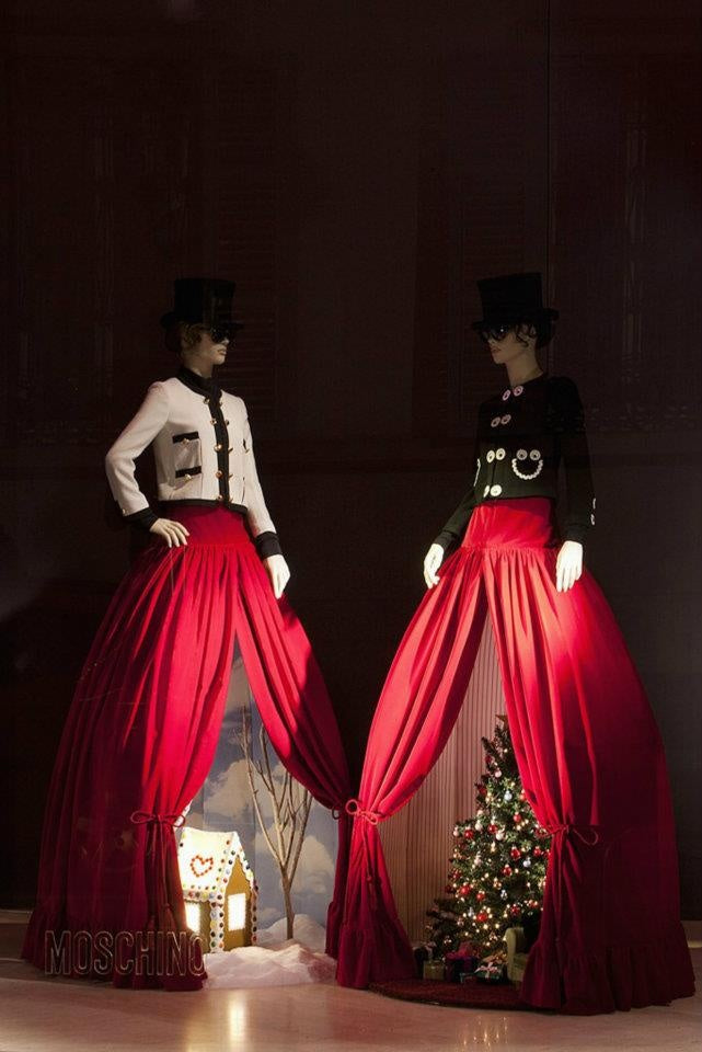
#48. This Chopard window display is positively glamorous! Those beautiful flowers are the product of Millington Associates, designed this year, 2015. It is a grand way to showcase jewelry and it makes you think of how well these items go together.

#47. We all know the amazing sneakers that Converse produces, but we rarely see what you can do with them in terms of window displays so designer Alexia Mosby created this particular display to show how different shoes can show off our personality. This woman also created a chandelier of sneakers in the store which looks amazing.

#46. Here is another window designed by Millington Associates for Il Bacio Di Stile showcasing how a tropical Christmas would look like.

#45. Louis Vuitton does it again, a very visually pleasing display created in 2012, from a multitude of colorful arrows to emphasize one bag.

#44. Another day, another Hermès display. In 2014 a stunning set of windows were created in the same theme, lights. It’s absolutely fantastic how the imagination can create such beautiful and captivating things.
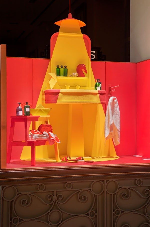
#43. The Galleries Lafayette is an upmarket French department store in Paris and as most of these types of stores they create lovely displays. This particular window focuses on making us want to daydream about living in a puffy bubbly empire.

#42. Changing the proverbial “bull in the china shop” with an elephant is absolutely incredible. Let alone making it so life like.

#41. Diving into surrealism again with this window for Selfridges, designed by Prop Studios. The mannequin heads were hand crafted to create that fish-like design.

#40. This intricate display was created for Gant in 2014. It has been made from tens of perfectly cut cardboard sheets to breathe life into this window. It’s almost as if we are looking into a mirror to find out who is inside.

#39. Another amazing window by Lanvin, from 2010. So simple, so elegant and it reimagines the idea of a painting, creating an entire story behind it.

#38. This year, Bergdorf Goodman paid homage to a cinematographic masterpiece, namely Crimson Peak. It showcases the dark atmosphere from the film in such detail that you feel like you’re walking by the set. Photo credits: Ricky Zehavi.

#37. Speaking earlier of the reflections in the mirror, we have here a display from Dior which portrays some sort of duality. Either way the colors and simplicity of the décor work in perfect harmony to grab the attention of anyone walking by.

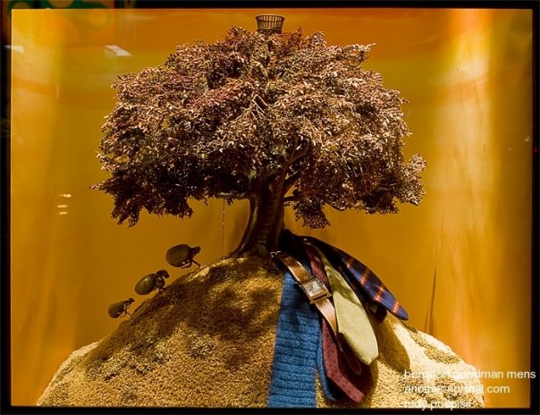
#36. The people over at Bergdorf Goodman had an awe inspiring idea to use the actual set from a stop motion animation movie, Fantastic Mr. Fox. They also added in the mix a couple of neckties and a watch to make sure that the idea is understood. Photo credits: Rudy Pospisil
#35. Still holding on to the displays created for Bergdorf Goodman this one is focused on well, butterflies. But that dress on the mannequin creates the illusion of a butterfly flapping its gorgeous wings. How lovely!

#34. This window from Selfridges 2012 brings a colorful and childish air to the table. It’s a fun thing to stand and watch, even if it’s static.

#33. Still here with another window from Selfridges from the same set in 2012 we discussed above. This one almost makes us feel like we are in a circus tent and watching completely astonished how the trapeze performers twirl around in mid-flight.

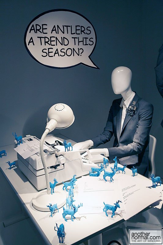
#32. Unfortunately we don’t have many details on this particular display but we think it might be from Hermès. Nonetheless this window is fun and gives a peek into the world of those who write for a living. That question by the way, priceless!
#31. Again we don’t know what shop this is but their display is absolutely fantastic. That levitating faucet from which blue shoes are pouring out is genius, especially since there are even lights installed between them. Every woman would love to own something like this, unlimited shoes!

We hope you found the inspiration you were looking for in this second part of our collection. Anyway, 30 incredible displays to go and you can get back to working on your store/project.