Mannequins


The Use Of Color In Apparel Stores: Best Practices & Tips
There are very simple steps that can be followed in order to improve the image of your store and this is something that retailers should take into account. Investment in visual merchandising is not that expensive as some might think; there is a lot to be done in terms of imagery that doesn’t necessary require a big amount of time or money. With simple things and ideas you can create a lot of interesting displays.
The Impact Of Color
Even though it might sound a bit far-fetched, the way in which we use the colors to decorate our store or just the displays, can really improve the way in which the merchandise, the store and the brand itself is perceived. Color can set a mood, invite inside or reject, according to the way in which we use it. Also, a good approach of color can create certain effects, such as chiaroscuro (known as a strong contrast between different colored areas) and trompe l’oeil (the use of color that can deceive the eye and create the impression of three-dimensionality). Just by the use of colors a dull and simple room may become a complex assembly in which you can sell your merchandise.
So in order to ensure the best use of colors in your store, remember that the twelve classical colors have their rules when it comes to combining them. Others simply don’t look good together, despite that nowadays we no longer perceive the equilibrium about mixing colors, everything seems normal just because it is everywhere. This is the reason why we don’t actually know why we like a particular store, car, bike or whatever, but we enjoy it because its color renders a certain feeling.

On Colors & Feelings
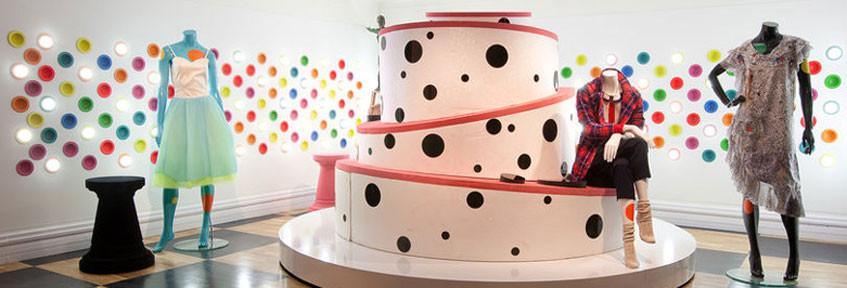
People tend to respond differently at certain colors: the warm ones (red, yellow, orange and colors with red or yellow hues, such as yellow-green, beige, peach, brown and orange-red) are stimulating and cheery. They can create a warm and intimate atmosphere. Warm colors have an impact on the dimension of the objects that are displayed, making them look larger and the room a bit smaller. Used on the end walls of a long and narrow room, a warm color may appear to “shorten” the room, this being an advantage for stores that function in a space that is not very proper.
Cool colors are blue, green, violet, colors containing blue, such as blue-green and violet-blue. These kinds of colors can help when we want to create a relaxing atmosphere. Spaces that use primarily cool colors tend to appear larger and more spacious. Cool colors are better to be used in smaller rooms.
Color Related Must Haves Best Practices:
The most useful things that you need to know when deciding to use certain colors in your store are the following:
» The most effective displays are those who use monochromatic themes / schemes because a large monochromatic area can be seen from afar.
» Try to avoid using background colors that affect / change the color and the aspect of merchandise. Green (but not deep hunter and earthly green), for example, is a color that shouldn’t be used for this specific reason.
Light colors such as pinks, yellows, blues and whites should not be used as background colors in the infant and toddler areas, because it is well-known that the dominant colors of clothes that are sold there are of this type. Background colors in girls’ departments should be kept neutral because of a wide range of colors that appear in a store of this type; boys’ departments should be illuminated with bright colors (for more, see also Visual Merchandising. A Guide for Small Retailers).
» It is advisable for certain colors not to be used in certain background, for example, silver should not be used along with a brown background because the reflection will make it appear tarnished.
» When you develop color schemes, take into consideration intensity, value and contrast: the more intense the color, the smaller the area it should cover. If you choose two colors, the more intense one is, the softer the other one should be. It isn’t advisable to combine more strong colors without changing the value or intensity.
» Neutral or main colors are best used for the floor, walls and background.
» Soft tints produce more effect than saturated hues.
» Bold combinations of colors can produce an astonishing view; they also have an effective outcome, but only if it is done in good taste.
Leave a comment
Comments will be approved before showing up.