Your Cart is Empty
Sale! Save up to 40% off on all orders. No coupon code necessary. Ends friday 3/6 Midnight EST.
Sale! Save up to 40% off on all orders. No coupon code necessary. Ends friday 3/6 Midnight EST.


We've been wondering for quite a while which are the absolute best window displays that have enchanted people all over the world. So we started looking for them and what we found left us mind-blown with the sheer creativity and multitude of bright lights, colorful materials and incredible mannequin use.
We know you came here for the images so let's just jump to it:
#100. Bergdorf Goodman always creates amazing window displays, this one here is no exception. The use of a gigantic bird is a really good way to turn heads on the streets and simply make people stop and stare at the glamorous window before them.

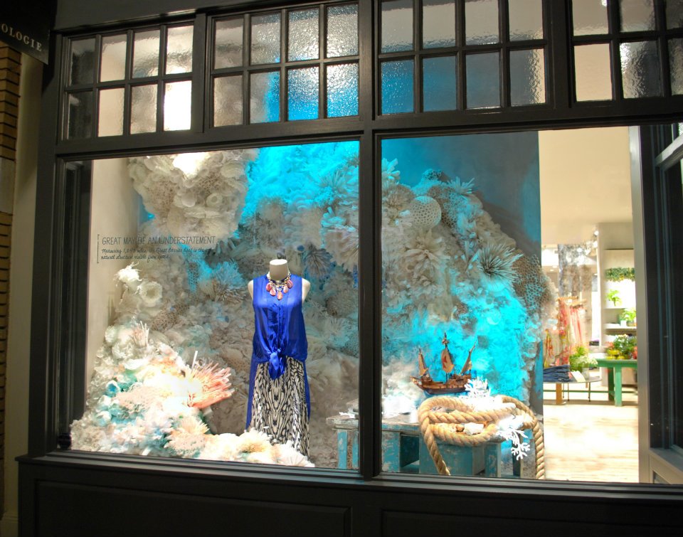
#99. Anthropologie has the most creative window displays, not just for the details, but for the materials they use and how they put their products into perspective. This particular display focuses on the underwater realm, it’s something they created for Earth Day in 2012, and it’s absolutely amazing.

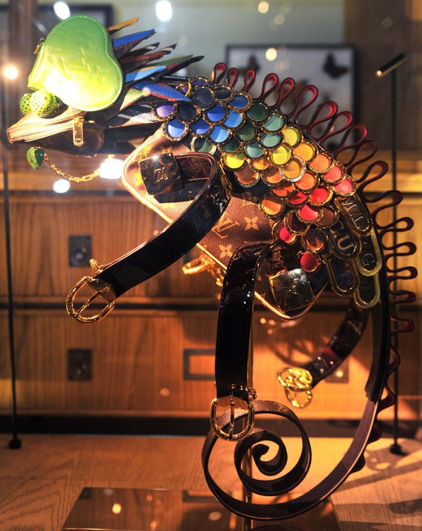
#98. This we would like to call more of an art installation rather than a display. Louis Vuitton surely had an incredible idea to turn their iconic products into a series of animal sculptures, if you may, back in 2011.

#97. London, when we think of this vibrant city, we instantly associate it with rain, fog and so on. This luxury store Hackett from London chose to use this weather idea in their display, creating a fantastic look. The wind seems to be blowing so powerfully that it lifts the mannequins, blows papers all around and ruins umbrellas.

#96 Via Bus Stop, Tokyo, Japan, 2013. Kazunori Matsumura & TYMOTE created one of the most impressive displays we’ve seen, simply because of the details. It took close to 1500 letters and 200 postcards to create this letter screen, with a dissolving effect.

#95. This is one of our favorites due to its simplicity. Lanvin from Paris has created multiple windows that seem to be extracted from our dreams. This particular display uses a vibrant blue color splash and only one mannequin wearing blue clothes of similar nuances trying to shield itself from the color.

#94. Moving along with Lanvin windows, Birds of paradise is the name of this set. You can clearly see why they chose this particular name and theme. It’s fantastic, as usual, they maintain the simplicity and manage to create an imposing look, sort of like a statue.

#93. We’ve discussed this one before, in the Halloween Displays article. Needless to say that it is absolutely gorgeous, while also sending a slight shiver down the back. The masquerade that these mannequins engage in is brought to life by fans and by the realistic masks.

#92. The 60 years anniversary of Chloé was celebrated fully by creating a dynamic window display. The single mannequin lies still while it is enclosed in a curtain of water. It’s sufficient to say that this is a jaw dropper.

#91. Here we have another Bergdorf Goodman display which is part of a series called “The arts”. Our favorite in this case was Architecture. It is a hyper complex display and besides its complexity, it was made completely out of paper and old blueprints.

#90. Hermès, with the magic hands at work in the Joann Tan Studio made a glamorous display, showcasing their luxury scarves as tubes of paint. The main colors of the scarves are displayed on the tubes creating a powerful contrast between design and texture.

#89. Dreamy is the best way to describe this Fenwick window display. It made us want to take a moment and imagine ourselves frolicking in the middle of a forest and we also wanted to do some shopping in that store.

#88. We stop again at Anthropologie to be amazed at the sight of this beauty. Composed of splendid flowers, mistletoe, leaves, a wolf and a sprinkle of snow, to get us in the mood for holiday shopping.

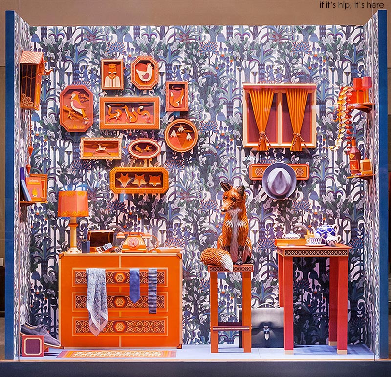
#87. This is an absolutely marvellous window display made for Hermès by Zim and Zou. A fox den with details made from paper and a realistic fox made from leather is enough to catch the eyes of everyone, literally, even people on the other side of the street must have stopped and stared in awe at this particular display, back in 2014.

#86. AY Architects created this particular display for Ted Baker in 2013, while there is not a particular master idea here, the details of the design astonish through simplicity and geometric perfection. The hero, a headless mannequin is displays the apparel of the brand in contrast with the white background, centring the focus.

#85. Printemps is a luxury department store in yes, Paris, France and Charles Kaisin had the amazing idea and patience to create this wondrous display. This layered green background takes our imagination to the northern hemisphere where we can see the Aurora Borealis. The contrast created with the mannequin and clothing further intensifies this dream like state we get when viewing this particular window.

#84. Still at Printemps we get to see yet another beautiful display, created for the Baccarat store that sells fine jewelry. Julien Colombier is the mastermind behind this window illustration which includes a surprising amount of fine details such as shoes, perfume bottle, jewellery and bags and of course the baby elephant in the “room” and a peacock. Photo credit: Francis Peyrat.

#83. Last one in this Printemps set, of course it is as fantastic as the others and again we greatly appreciate the simplicity and power of the display, by using mannequins with flower bouquets as heads. Amusingly enough, the display was created to celebrate spring, “La fête du printemps”, printemps in French meaning spring.

#82. In 2013, for Valentine’s Day, Tiffany stole the hearts of passers-by, maybe even some wallets. This is a straight to the point kind of window, putting the jewellery in focus.

#81. Yet another fantastic display from the one and only Bergdorf Goodman, back in 2013. It exploits the rawness and anarchy of the punk style. The details make it a stunning installation, especially the make-up and hair of the mannequin and that giant guitar on the wall.

#80. We go back to the anniversary of Chloé, to the windows designed by Bob Recline. This particular piece is very colorful and dark at the same time, creating an attractive contrast and by using box frames with twine it echoes simplicity and also dynamism.

#79. The next windows you will have the pleasure of viewing are all by Anthropologie. A business that left a powerful mark on their clients due to their absolutely astonishing window displays made mostly from recycled materials. This one in particular is captivating simply because of that uneven dark blue background and golden details which give off the impression of an embroidery that’s coming to life.

#78. This display can be simply characterized by the word “pastel”. Those splendid panels arranged as a rainbow put the clothing on the mannequins in focus. Their design team is absolutely genius, makes us want to hire them for some interior decorations.

#77. A gorgeous Christmas display, comprised of a floral arrangement, fake snow, a mannequin with the designer clothes and a giant swan with wings perfectly spread. Absolutely enchanting!

#76. This window display acts as a summer mirror. On one side we have a field of lavender at the edge of a forest in perfect detail and its reflection is distorted and literally pops out.

#75. Another Earth Day display celebrating the migration of monarch butterflies to central Mexico. A giant panel with hundreds of colorful butterflies made from paper is the perfect homage to this marvellous event.

#74. Now this is absolutely exquisite, it is nothing short than a dream. Those burgundy hot air balloons seem to be made from velvet and the fact that they pop out of that dreamy background gives this window a hint of reality.

#73. This is the last Anthropologie display for now and is yet again created for Christmas in 2013. It is splendid simply because of the used/rusted colors on this beautifully carved and decorated detail.

#72. Travelling back in time to 2008 at Bergdorf Goodman, someone whose name we don’t know, had the patience and inspiration to create famous portraits from post-its - the one you are currently viewing is of Mona Lisa.

#71. Moving one year forward, in 2009, Lewis Carroll created this impressive piece. It is an ode to nature and spring. Those moss horses with grass manes are clearly the most impressive details of this Bergdorf Goodman display.

#70. Millington Associates create some of the best displays we’ve ever seen, and this one from Selfridges is no exception. Made this year, 2015, this display is visually powerful through the choice and use of colors and creating that marvellously immense jacket, which reveals a yellow mannequin with a gorgeous dress.

#69. Moving on to the amazing window installation from Harrods made by Millington Associates. This luxury department store makes events for revealing their windows because they are absolutely the best! This is no different, a giant octopus holding champagne bottles, it is crafted to perfection, and they even included reflections from the water.

#68. This is a history lesson. The display was created by Simon Millington, the founder of Millington Associates back in 1990 for Dickins & Jones. We believe it portrays the American Christmas Dream.

#67. We’re back at Tiffany’s again to this awesome display from 2012, dedicated to Central Park, New York. The iconic gate is miniaturized and exquisite jeweled key necklaces are displayed on it.

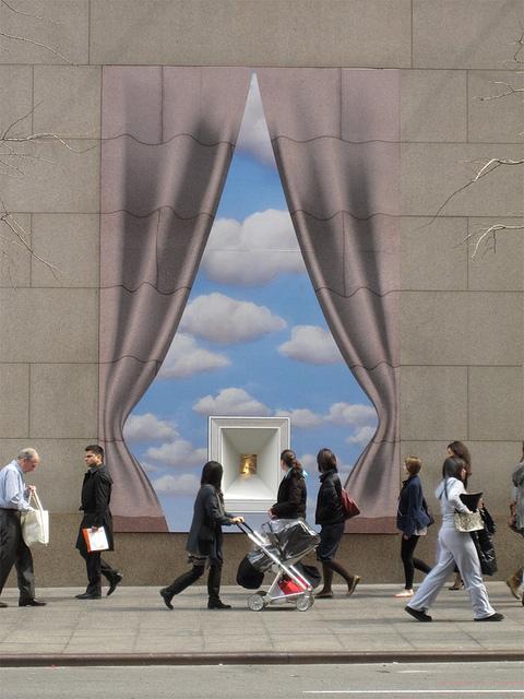
#66. Out of the concrete jungle, the walls are parted like curtains to reveal the glimmer of Tiffany’s jewelry between the clouds. Makes you stare with wonder at how they managed to showcase something so small in a big way.

To avoid huge loading times for our readers we've broken down the 100+ displays into 3 separate pages. If you're impressed with what you've seen already, wait until you get to part #2 & #3 - some displays are absolutely out of this world.